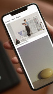
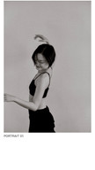
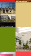
Portfolio Website
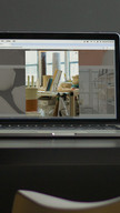
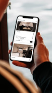
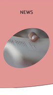
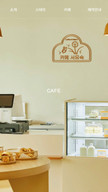
사진 스튜디오의 포트폴리오 웹사이트입니다. 사진 작업이 중심이 되도록 화려한 그래픽보다는 정보의 간결한 정리와 부드러운 움직임에 중점을 두어 제작했습니다.
A portfolio website for a photography studio. The site was designed to prioritise the presentation of photographic work, focusing on concise organisation and smooth transitions rather than flashy graphics.
Planning 50Design 100Web Publishing 100
Adobe Illustrator, HTML/CSS, Javascript
Website (Desktop/Mobile)


Promotion Website
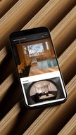
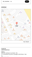
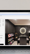
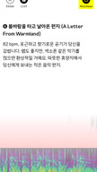
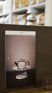
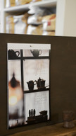
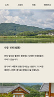
기존 숙박 플랫폼에서 아늑료칸의 콘텐츠가 충분히 드러나지 않는 문제를 보완하기 위해, 사이트맵 역할을 하는 웹사이트를 기획하고 퍼블리싱했습니다. 디자이너의 프로토타입을 바탕으로 구현하면서 디자인과 기능을 함께 조율했으며, 세로쓰기 구현 시 기기와 브라우저 간 간격·크기 차이를 조정하는 작업도 병행했습니다.
A sitemap-style webpage was developed to supplement how Aank Ryokan’s content was underrepresented on existing accommodation platforms. Based on the designer’s prototype, I handled web publishing and fine-tuned both layout and functionality. Additional adjustments were made to address vertical text rendering inconsistencies across devices and browsers.
Design 20Web Publishing 100
Adobe XD, HTML/CSS, Javascript, Jquery
Website (Desktop/Mobile)
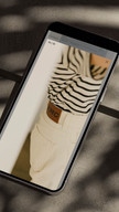
E-Commerce Website
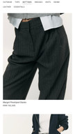
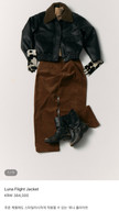
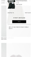
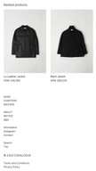
패션 브랜드 카달로그의 이커머스 쇼핑몰 웹사이트로, 강한 그래픽이나 색상보다는 브랜드 무드와 제품에 어울리는 차분한 톤을 구현하는 데 집중했습니다.
This is an e-commerce website for the fashion brand Cadalogue. The design focused on creating a subdued tone that complements the brand’s mood and products, rather than using strong graphic or color elements.
Planning 50Design 100Web Publishing 50
Imweb, CSS, Javascript, Jquery
Website (Desktop/Mobile)


Accommodation Interactive Webpage
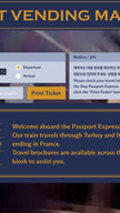
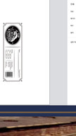
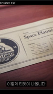
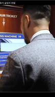
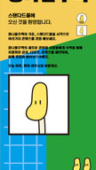
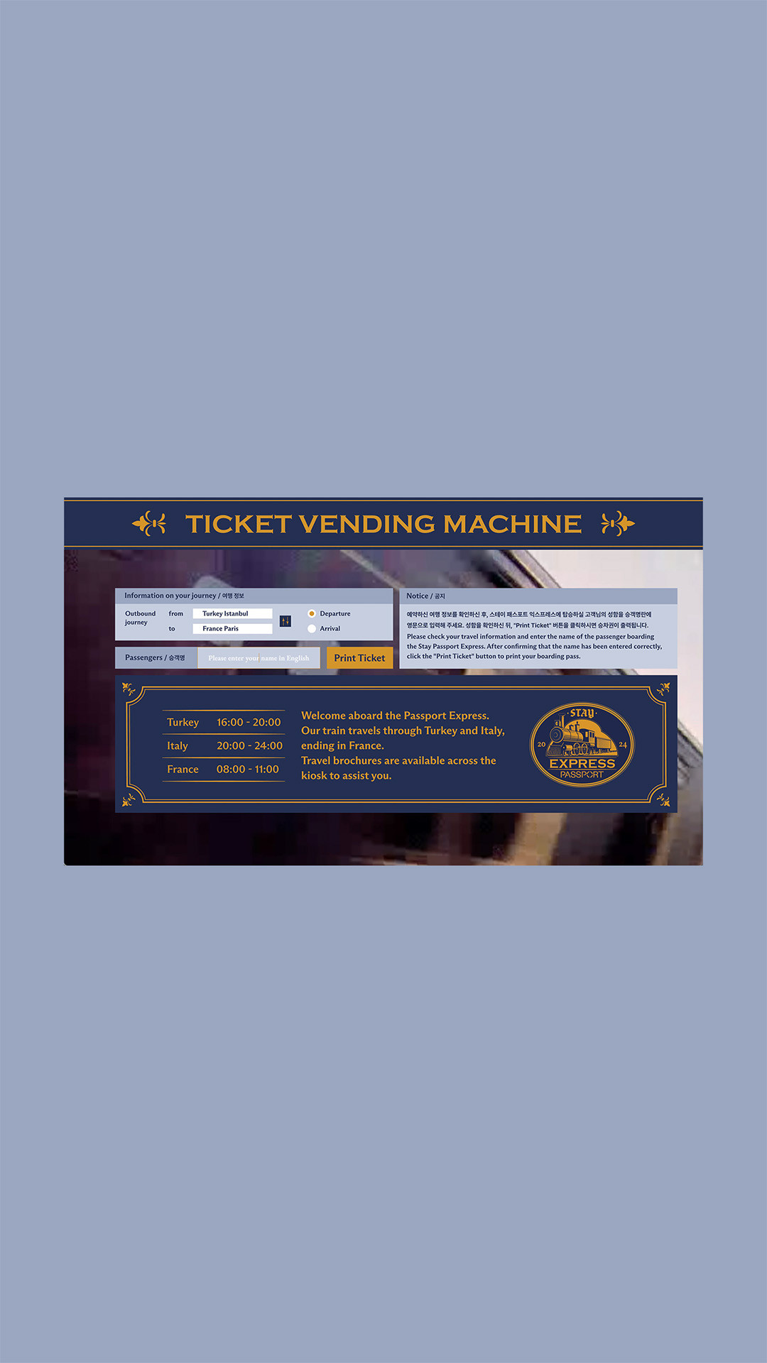
스테이 패스포트 익스프레스 1층 로비에서 티켓을 수령할 수 있도록 제작한 웹페이지입니다.
A webpage designed for visitors to collect their tickets from the ground floor lobby of Stay Passport Express.
Design 30Web Publishing 100
HTML/CSS, Javascript
Website (Desktop/Mobile), For Chromium browser
Micro Website
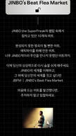
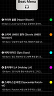
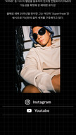
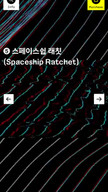
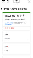
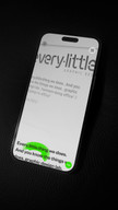
아티스트 진보(JINBO the SuperFreak)와 팀 KHL의 협업으로, 직접 작곡한 비트(Instrumental)를 경매 방식으로 판매하기 위해 제작한 웹페이지입니다. 외부 플랫폼 이용 시 발생하는 수수료와 소통 문제를 고려해 자체 웹사이트로 제안했고, 빠르고 안정적인 구현을 위해 구글 폼과 시트를 연결해 구성했습니다.
A collaborative project with JINBO the SuperFreak and Team KHL. This website was designed to auction JINBO’s original beats, using Google Forms and Sheets for fast and secure implementation, as an alternative to existing platforms with fee and communication issues.
Planning 30Design 100Web Publishing 100
Figma, HTML, CSS, Javascript, Jquery
Website (Desktop/Mobile)
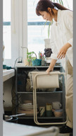
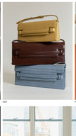
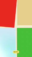
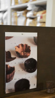
Accommodation Service Webpage
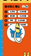
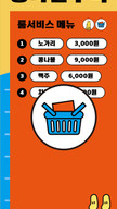
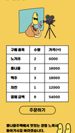
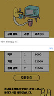
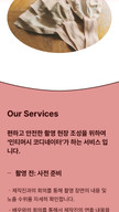
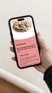
전주 콩나물주택의 룸서비스 웹페이지입니다. 숙소에서 QR 코드를 스캔해 접속하고, 상품을 담아 주문할 수 있도록 구성했습니다.
This is the room service webpage for Kongnamul-Jutaek in Jeonju. Guests can access the site via a QR code, browse items, and place an order from their room.
Design 30Web Publishing 100
Adobe Illustrator, HTML/CSS, Javascript
Website (Desktop/Mobile)
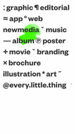
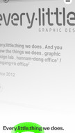
Portfolio Website
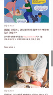
브랜드 아이덴티티와 잡지, 포스터, 브로슈어 등 다양한 매체를 다루는 디자인 스튜디오의 웹 포트폴리오 사이트입니다. 기존 웹사이트의 키워드(SEO)를 기반으로 메인 페이지 구조를 구성했으며, 디자인, 프론트엔드 구현 및 퍼블리싱을 담당하고 백엔드 개발자와 협업했습니다.
A portfolio website for a design studio that works across various mediums such as magazines, posters, and brochures. The main page structure was organised based on SEO keywords from the previous website. I handled the design, front-end development, and publishing, in collaboration with a back-end developer.
Planning 100Design 80Web Publishing 50
Figma, Adobe Illustrator, HTML/CSS, Next js, Jquery
Website (Desktop/Mobile)
everylittlething.co.kr Part of the assets(Figma)
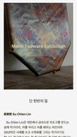
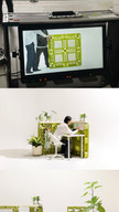
Exhibition & Workshop Archive Website
산수화의 갤러리 밪에서 진행한 전시와 워크숍을 아카이빙한 웹사이트입니다. 콘텐츠를 균일하게 보여주기 위해, 이미지나 포스터가 없는 전시와 워크숍의 썸네일을 별도로 제작했습니다.
An archive website of exhibitions and workshops held at Gallery BAAT. For consistent presentation, custom thumbnails were created for events without clear photos or posters.
planning 100Design 100Web Publishing 100
Figma, Adobe Illustrator, HTML/CSS, Javascript
Website (Desktop/Mobile)
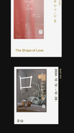
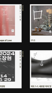
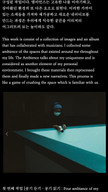
Online-Exhibits Website
파주타이포그라피배곳 대학원 과정 졸업 작업과 함께 온라인 졸업 전시 웹사이트를 기획·제작했습니다. 6명의 졸업 작품이 일러스트, 사운드, 영상, 글꼴, 공간, 웹 등 다양한 매체로 구성되어 있어, 이미지 사용을 최소화하고 웹에서 조화롭게 보이도록 임의 배열 방식을 활용해 제작했습니다.
I curated and created an online graduation exhibition website for the postgraduate course at Paju Typography Institute. The six graduating students’ works spanned various media—illustration, sound, video, font, space, and web. To ensure a harmonious presentation, the website minimised image use and utilised random arrangement suitable for web display.
Planning 70Design 70Web Publishing 100
Adobe Illustrator, HTML/CSS, Javascript
Website (Desktop/Mobile)

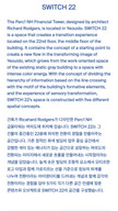
Teen centre proposal website
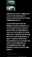
움직이는청소년센터 EXIT의 프로젝트 TEAM2200 기획서를 종이 문서 대신 웹페이지 형식으로 제안하였고, 글 중심의 정보를 온라인에서 효과적으로 전달할 수 있도록 구성했습니다.
I proposed presenting the TEAM2200 project plan of Moving Teen Centre EXIT as a webpage instead of a paper document, to make it more accessible to a broader audience. I focused on presenting text-oriented content effectively in a web format.
Planning 50Design 70Web Publishing 100
HTML/CSS, Javascript
Website (Desktop/Mobile)

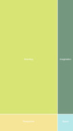
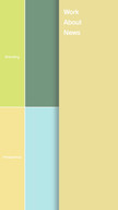
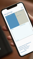
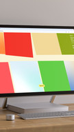
Portfolio Website
도시와 자연 속의 편안함을 공간, 브랜딩, 그래픽 디자인으로 표현하는 디자인 스튜디오의 웹사이트입니다. 각 프로젝트의 주요 색상을 바탕으로 페이지를 구성했으며, 디자인 유연성을 확보하기 위해 웹 빌더 대신 직접 구축했습니다.
A website for a design studio that conveys the comfort of urban and natural environments through space, branding, and graphic design. Each page was composed using the key colours of its respective project, and built manually to ensure design flexibility rather than relying on a website builder.
Planning 50Design 50Web Publishing 100
Adobe Indesign, HTML/CSS, Javascript, Jquery
Website (Desktop/Mobile)

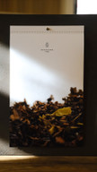
Brand Promotion Calendar
산수화의 2025년 달력을 제작했습니다. 각 달의 계절감과 분위기를 잘
전달하기 위해 사진을 선정하고, 날짜 배열도 달마다 다르게
구성했습니다. 딱딱한 표 형식 대신 실내 어디에 두어도 편안히 볼 수
있도록 디자인했습니다.
상단 타공(6⌀)을 내어 벽이나 냉장고 등에 걸 수 있게 두꺼운 실로
단단히 묶었고, 달이 지나면 한 장씩 깔끔하게 떼어내어 다른 용도로
활용할 수 있도록 했습니다.
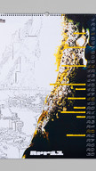
I created the 2025 calendar for Sansuhwa, selecting images that
reflect the mood and seasons of each month. The dates are arranged
differently for each month to enhance the calendar’s visual appeal
rather than focusing solely on functionality. Instead of a
conventional grid format, the design allows the calendar to be
comfortably viewed anywhere indoors.
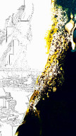
A 6mm hole was punched at the top to hang it on walls or
refrigerators with thick string, and each page can be cleanly torn
off month by month for other uses.
Adobe Photoshop, Adobe Indesign
print (Graphic/Volumes)
Promotion Website
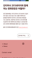
일본, 아프리카 등지에서 활동하는 인티머시 코디네이터의 한국 활동을 위해, 기존 해외 웹사이트의 콘텐츠를 그대로 담으면서도 한국 사용자에게 친숙한 디자인을 구현하는 데 중점을 두었습니다.
For the Korean activities of the Intimacy Coordinators active in Japan, Africa, and elsewhere, I retained the content from existing overseas websites while creating a design familiar to Korean users.
Planning 80Design 100Web Publishing 100
Squarespace, Javascript
Website (Desktop/Mobile)
[*] 인티머시 코디네이터 제팬:intimacy coordinator Japan: intimacy-co.jp

Promotion Website
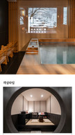
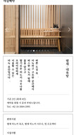
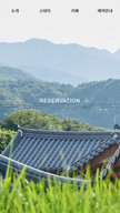
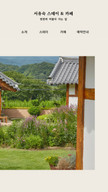
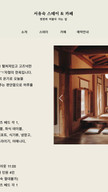
한옥 스테이 서유숙의 공간과 주변 풍경을 닮은 옅은 아이보리 계열 색감을 사용하고, 공간의 분위기에 맞춰 넉넉한 여백의 디자인을 적용했습니다.
The design uses a pale ivory color scheme inspired by the space and its surroundings, with generous white space to match the ambiance.
Planning 30Design 30Web Publishing 100
HTML/CSS, Javascript
Website (Desktop/Mobile)

Condensed Hangul Font
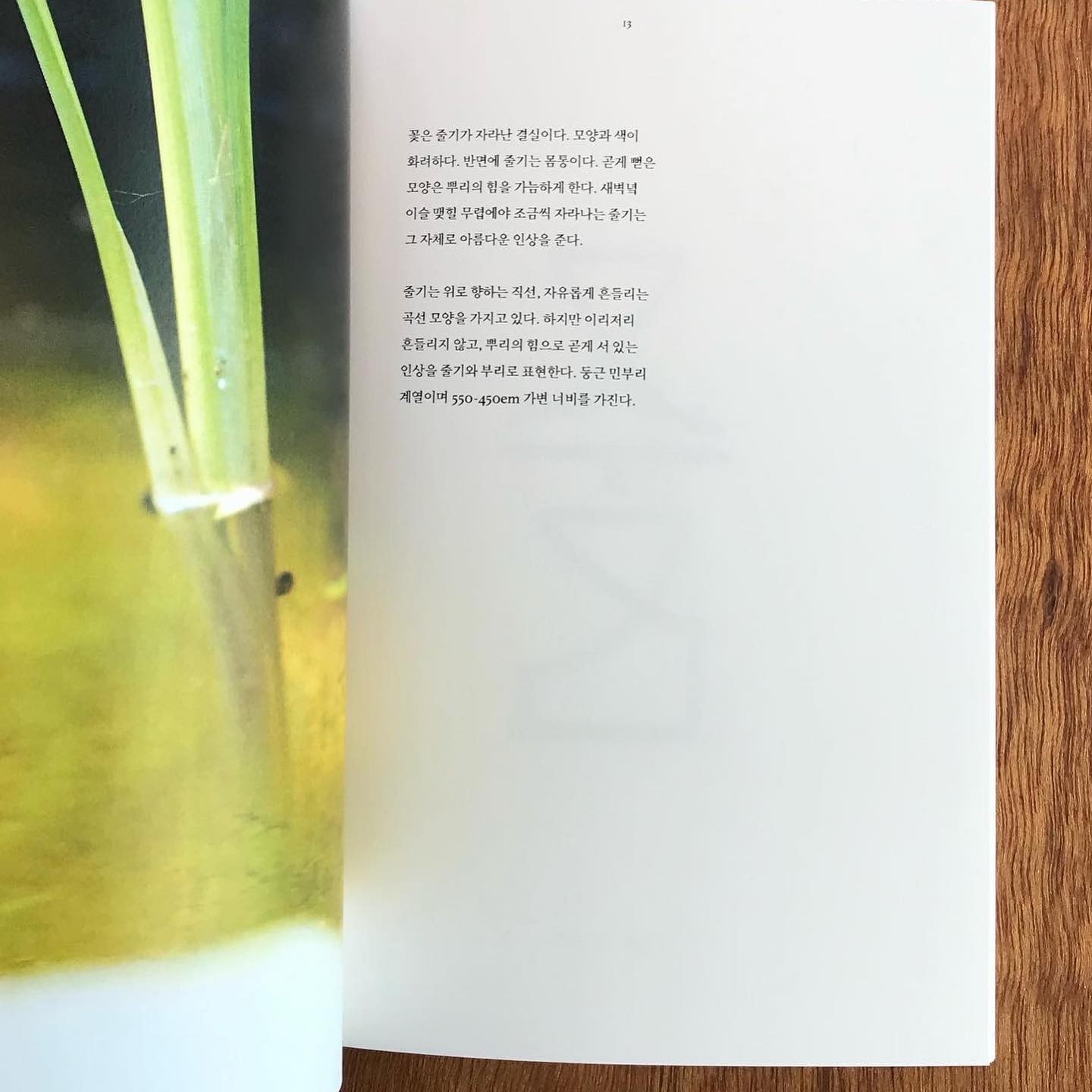
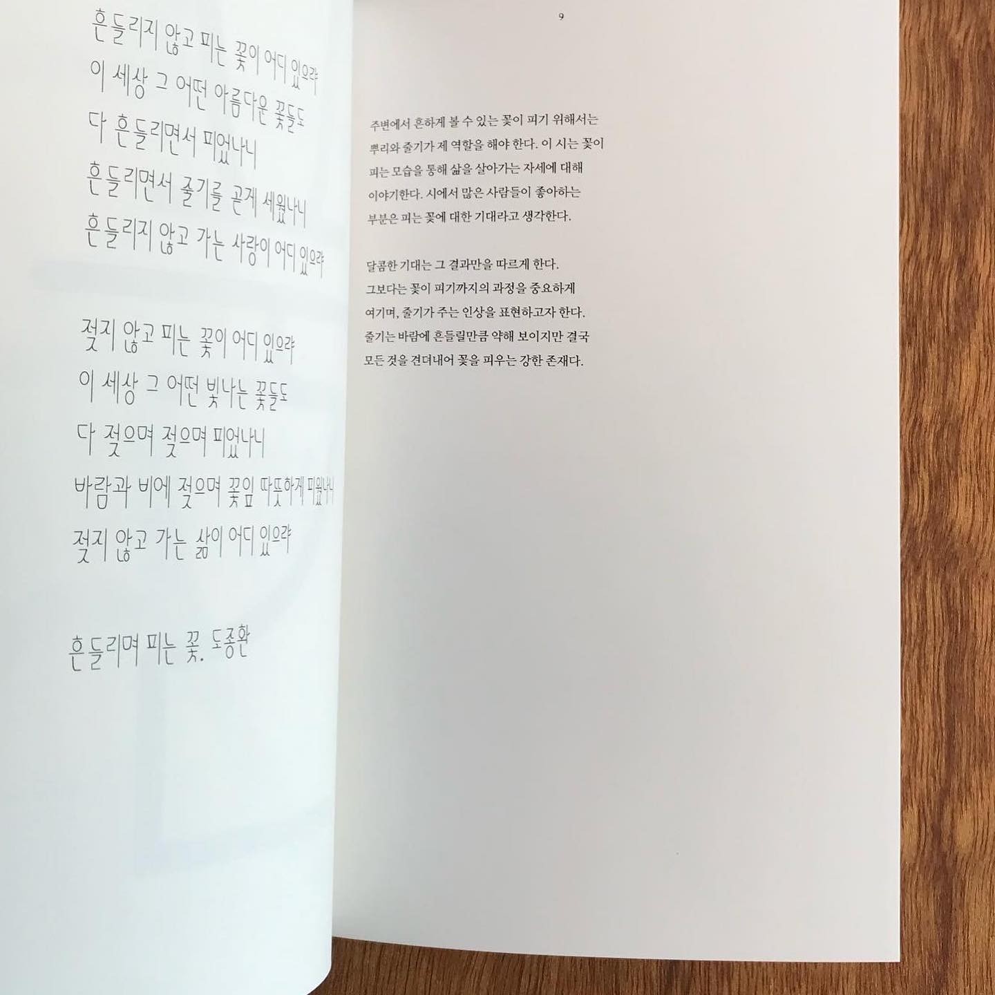
“주변에서 흔하게 볼 수 있는 꽃이 피기 위해서는 뿌리와 줄기가 제
역할을 해야 합니다. 달콤한 기대는 그 결과만을 따르게 합니다.
그보다는 꽃이 피기까지의 과정을 중요하게 여깁니다.”
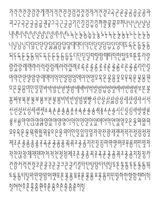
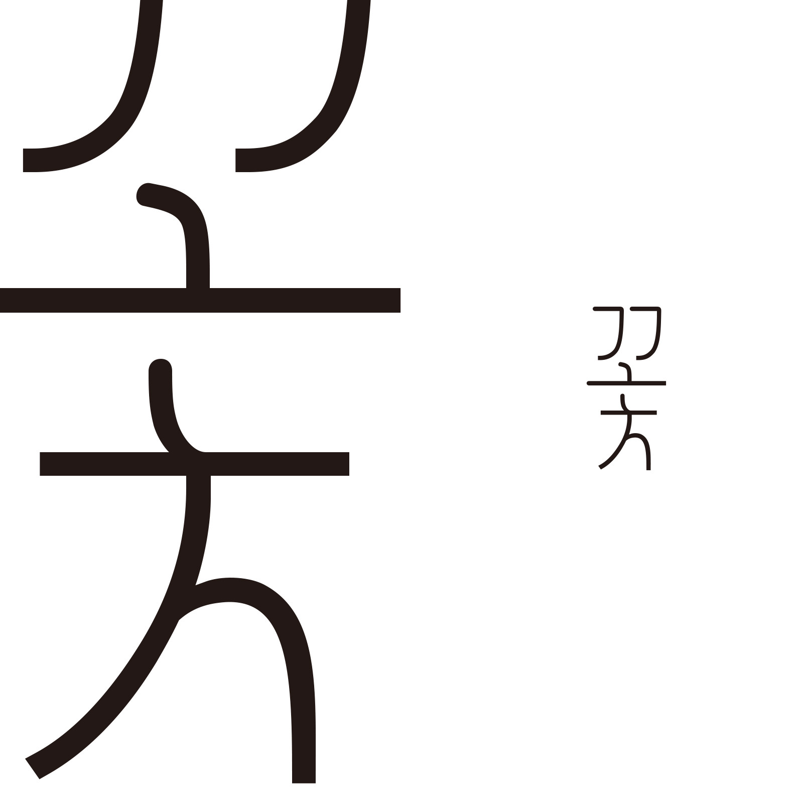
완성형 한글 2350자 중 1000자의 글자 조합을 만들고, 그 과정을 담은
글꼴 보기집을 제작했습니다.
“The roots and stem must fulfil their function if the flowers we
see around us are to bloom. While it is important to have clear
expectations, it is the process that leads up to the result that
is truly valuable.”
I created font combinations for 1000 of the 2350 complete Korean
characters and made a font book documenting the process.
Glyphs, Adobe Indesign
Work (Graphic/Volumes)

Historical anniversaries calendar
디자인 스튜디오 일상의 실천과 함께 2021년 달력 4월의 메인 이미지를 제작했습니다. 4월 4일 종이 안 쓰는 날, 4월 16일 세월호 참사, 4월 20일 장애인차별철폐의 날, 4월 22일 지구의 날을 표현하기 위해 ‘부서진, 긁힌 자국, 녹슨 것’ 등의 키워드를 바탕으로 그래픽을 만들었으며, 바다의 기름 유출 사고를 나타내기 위해 실제 폐기름을 촬영해 그래픽 작업에 활용했습니다.
I collaborated with the design studio Everyday Practice to create the main image for April in the 2021 calendar. Using keywords like ‘broken, scratched, rusty,’ I designed pixel art-style graphics and incorporated photographs of actual waste oil to symbolize an oil spill in the ocean. Selected anniversaries featured include April 4th (No Paper Day), April 16th (Sewol Ferry Disaster), April 20th (Disability Discrimination Abolition Day), and April 22nd (Earth Day).
Adobe Illustrator, Adobe Photoshop
print (Graphic/Volumes)
everyday-practice.com/a-history-of-practice/
Editorial, Experience Design
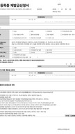
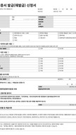
공공기관에서 발행하는 민원 서식을 리디자인했습니다. 단순히 서식지를 보기 좋게 만드는 데 그치지 않고, 사용자가 작성하고 제출하는 과정과 관리자가 접수 및 처리하는 업무를 함께 고려하며 작업했습니다.
I redesigned a public service complaint form issued by government agencies. The focus was not only on improving the visual design but also on enhancing the user experience for both the person filling out and submitting the form and the administrator handling its reception and processing.
planning 50Design 50
Hangul Word Processor, Adobe Indesign
print (Graphic/Volumes)
 infoinfo
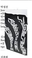
 Park jeong-gyeonPark jeong-gyeon
 MenuMenu
닫기close
MenuMenu
닫기close
 목록list
 미리보기thumb
 확장expand
 기본grid
 초기화reset
 웹web
웹web 인쇄print
 기획planning
 협업collab
 ENG
ENG KOR
KOR 어둡게dark
 밝게light
사용자가 느끼는 서사 중심의 시각 설계를 통해 서비스·브랜드의 방향과 사용자 경험을 연결하고, 디자인을 단기적인 결과물이 아닌 지속 가능한 자산으로 만드는 것을 목표로 하고 있습니다.
I aim to connect brand and service direction with user experience through narrative-driven visual design, creating outcomes that are not just short-term deliverables but long-lasting assets.

스튜디오 릴리즈
studio release
웹
web

아늑료칸 파주
aank ryokan paju
웹
협업
web
collab

카달로그
Cadalogue
웹
web
스테이 패스포트 익스프레스 티켓
stay passport express ticket
웹
협업
web
collab

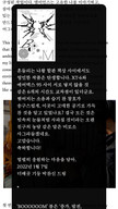
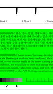
JINBO's BEAT FLEA MARKET
JINBO's BEAT FLEA MARKET
웹
기획
web
planning

콩나물주택 룸서비스
kongnamul-jutaek roomservice
웹
협업
web
collab

에브리리틀씽
everylittlething
웹
기획
협업
web
planning
collab

갤러리 밪 아카이브
gallery BAAT archive
웹
기획
web
planning

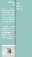
boooooom!
boooooom!
웹
기획
협업
web
planning
collab

청소년센터 TEAM2200
Teen centre TEAM2200
웹
기획
협업
web
planning
collab

스튜디오 베리띵즈
studio verythings
웹
협업
web
collab

2025 산수화 달력
sansuhwa calendar 2025
인쇄
기획
planning

인티머시 코디네이터 코리아
intimacy-coordinator korea
웹
web

한옥 스테이 서유숙
stay seoyoosuk
웹
협업
web
collab

곧은순
godeunsoon
인쇄

2021 일상의 역사 달력
a history of practice calendar 2021
인쇄

민원 서식 개선
public office complaints redesign
인쇄
기획
협업
planning
collab